.webp)
A customer lands on your website ready to buy.
But instead of feeling guided, they immediately feel overwhelmed.
Six pricing plans. Endless comparison tables. Pop-ups competing for attention. Multiple buttons asking them to take different actions at the same time. What should feel simple suddenly feels mentally exhausting.
So instead of converting, they hesitate.
Then they leave.
Most businesses assume more choices improve the customer experience. More plans should mean more flexibility. More features should increase value. More options should help customers find the “perfect” fit.
But psychology often shows the opposite.
This is called the “paradox of choice” or “choice overload” — the idea that while people like having options, too many options can quietly make decision-making harder instead of easier. Instead of feeling empowered, customers start feeling anxious, uncertain, and mentally overloaded.
And overloaded customers rarely convert quickly.
Why Too Many Choices Create Decision Paralysis
At first glance, offering more options seems smart.
But when customers are forced to compare too many similar choices at once, the brain starts working harder to evaluate risks, differences, and possible outcomes. Instead of clarity, people experience decision fatigue.
That’s when hesitation starts creeping in.
Customers open multiple tabs. They tell themselves they’ll “come back later.” They keep researching because they’re afraid of making the wrong choice. Sometimes they abandon the decision entirely because doing nothing feels easier than choosing incorrectly.
This is where many businesses accidentally confuse being informative with being overwhelming.
Helpful information reduces uncertainty. Too much information increases friction.
Ironically, more choices can also reduce confidence instead of increasing it. When every option feels important, customers start second-guessing themselves:
“Did I pick the right plan?”
“What if another option is better?”
“Am I missing something?”
That uncertainty quietly weakens conversions.
How Websites Quietly Overwhelm Visitors
Choice overload rarely looks dramatic on a website.
Most of the time, it hides behind “helpful” design decisions.
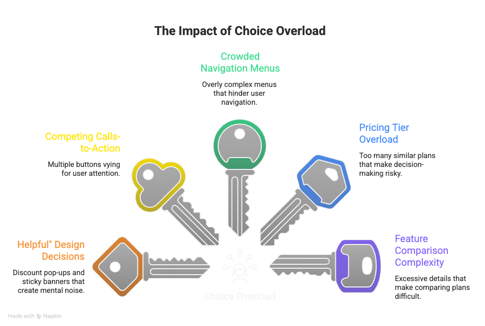
A discount pop-up here. A sticky banner there. Multiple calls-to-action competing for attention. Crowded navigation menus. Five pricing tiers. Endless feature comparisons. Individually, none of these elements seem harmful.
Together, they create mental noise.
Instead of guiding visitors toward one clear action, many websites unintentionally force users to make too many decisions at once:
Should I book a demo?
Start a free trial?
Download the guide?
Watch the video?
Compare plans?
When everything demands attention, the next step becomes unclear.
And confusion quietly lowers conversions.
This becomes especially obvious on pricing pages. Businesses often assume more plans create flexibility, but too many similar options can make the decision feel risky instead of simple. Customers become overwhelmed comparing features, integrations, limits, upgrades, and add-ons all at once.
That’s why many of the highest-converting websites feel surprisingly simple.
Fewer distractions. Fewer competing actions. Less unnecessary friction.
Because good conversion design is not about giving visitors more things to process.
It’s about making the right decision feel obvious.
When “More Features” Actually Hurt Conversions
Many businesses believe adding more features automatically makes an offer more attractive.
More tools. More upgrades. More customization.
But in reality, too many features often make customers less confident, not more.
When plans or products look nearly identical, customers struggle to understand which option is actually right for them. Feature-heavy comparison tables can quickly become mentally exhausting, especially when every difference feels technical or difficult to evaluate.
The customer stops thinking:
“This looks useful.”
And starts thinking:
“What if I choose the wrong one?”
That hesitation becomes even stronger with expensive or unfamiliar purchases like SaaS tools, subscriptions, or high-ticket services. The more complicated the decision feels, the more customers delay action.
Ironically, simplifying choices often improves buyer confidence.
That’s why many brands increase conversions after reducing pricing tiers, removing unnecessary add-ons, or highlighting one recommended option. Fewer choices often create faster decisions because customers feel guided instead of overwhelmed.
The goal is not removing flexibility completely.
It’s removing unnecessary complexity.
The Smartest Brands Make Decisions Feel Easy
High-converting brands understand something important:
Customers do not want to work harder to buy.
The best websites are usually not the ones with the most features or the most offers. They are the ones that make decisions feel simple, clear, and low-stress.
That often starts by limiting primary choices. Fewer pricing plans. Fewer calls-to-action. Fewer competing decisions.
Smart brands also guide users instead of forcing them to figure everything out alone. “Recommended” plans, onboarding quizzes, guided flows, and curated suggestions reduce uncertainty and help customers move forward confidently.
Another effective strategy is progressive disclosure — showing the most important information first, then revealing extra details only when needed. This keeps pages cleaner and decisions lighter.
Because clarity reduces friction.
When customers instantly understand what to do next, conversions feel easier. The buying process feels smoother, faster, and more confident.
And that simplicity is often what separates high-converting brands from confusing ones.
Conclusion — Simplicity Converts Faster Than Complexity
Most businesses assume more options improve the customer experience.
More features. More plans. More buttons. More offers.
But customers do not always want more choices.
Often, they want more clarity.
The easier a decision feels, the more likely people are to act. That’s why simplifying navigation, reducing unnecessary options, and guiding users clearly through the buying process often improves conversions more effectively than adding more complexity ever could.
Because when customers feel overwhelmed, they hesitate.
And hesitation quietly kills conversions.
The brands that convert best are rarely the ones offering the most options.
They are the ones making decisions feel simple, obvious, and safe.
FAQs
1. What is “choice overload” in marketing?
Choice overload happens when customers are presented with too many options at once, making decisions feel stressful instead of simple. Instead of increasing conversions, excessive choices often lead to hesitation, confusion, and abandoned purchases.
2. How do too many choices lower conversion rates?
When visitors must compare too many plans, products, features, or calls-to-action, decision-making becomes mentally exhausting. This creates friction, slows down action, and increases the chances of users leaving without converting.
3. What are common signs a website has too many choices?
Common signs include cluttered pricing pages, multiple competing buttons, excessive pop-ups, overwhelming comparison tables, confusing navigation menus, and too many similar plans or product variations.
4. Is offering fewer options always better for conversions?
Not always, but simplifying decisions usually improves clarity and confidence. The goal is not removing useful flexibility — it’s removing unnecessary complexity that overwhelms customers and makes the next step unclear.
5. How can businesses reduce choice overload on their website?
Businesses can reduce choice overload by limiting primary calls-to-action, simplifying pricing options, highlighting recommended plans, removing redundant features, and guiding visitors through a clearer, more focused customer journey.